Photo Gallery
Welcome to our tutorial on adding and managing Photo Galleries on your website. Photo galleries are a great way to increase customer engagement by offering visuals of your products or services. In this tutorial we will cover the various types of photo galleries, how to add them to the page, and how to edit the images that are displayed. To begin click the arrow next to a topic below and our visual guide will appear. To advance to the next step simply click the next button inside the appropriate box.
- There are several different types of Photo Gallery, including Filmstrip 1, Filmstrip 2, Grid, Single Image, Slideshow 1, Slideshow 2, Responsive Grid and Responsive Carousel. To learn how to add one of these widgets, please follow the instructions on the Add a New Widget page
The photo galleries are split into two different groups, Responsive and Legacy. For the most part, we recommend using the Responsive galleries.
Responsive
- Carousel - Displays image thumbnails in a row, with arrows to cycle to the next few thumbnails.
- Grid - Displays image thumbnails in a grid.
- Slideshow - Displays one image at a time, with the next image replacing it after a brief amount of time.
Legacy
- Filmstrip 1 - Displays one image at a time, with a strip of thumbnails at the bottom to display the other images.
- Filmstrip 2 - Displays a strip of thumbnails, clicking on one will show the full size image in popup.
- Grid - Displays image thumbnails in a grid, clicking on one will show the full size image in a popup.
- Single Image - Displays one image at a time, with left/right arrows to cycle between the other images.
- Slideshow - Displays one image at a time, with the next image replacing it after a brief amount of time.
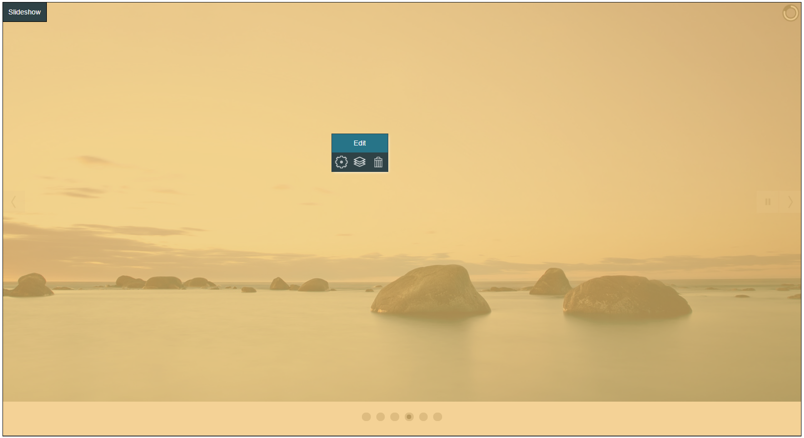
- Move your mouse over the Photo Gallery widget you would like to edit. The widget will highlight in orange and the Hover Menu will appear.

- Click Edit

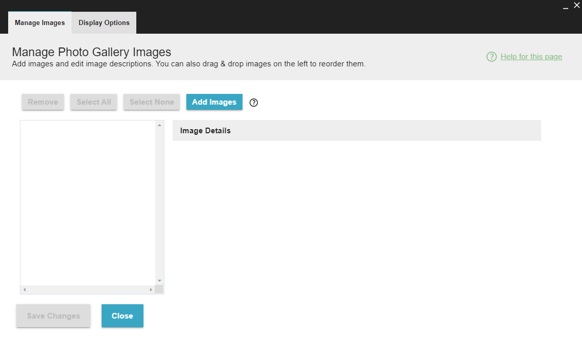
- The Manage Photo Gallery Images window will open.

- Click Add Images.

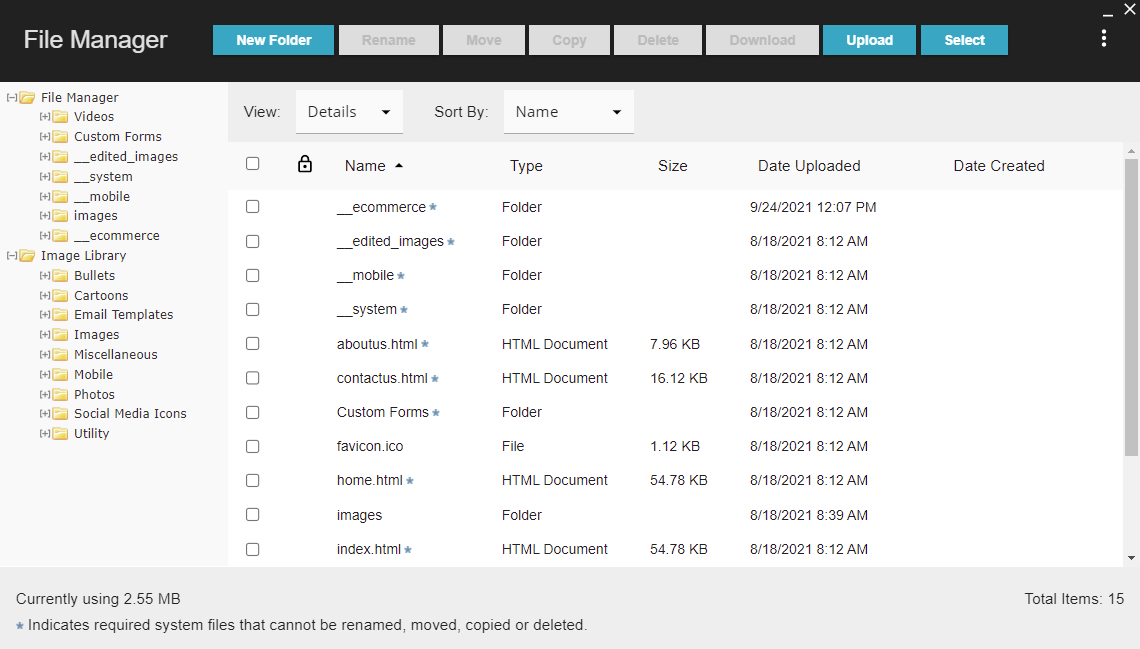
- The File Manager will open.

- Find the images you wish to use, check the boxes next to them, then click Select.

- When you're done, click Save Changes.

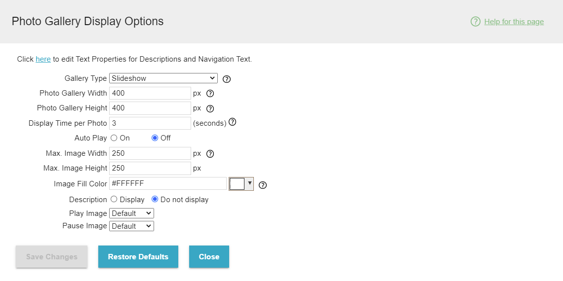
You can edit some appearance settings for the photo gallery by editing the widget and clicking the Display Options tab. Some options will only display for certain types of gallery.

- Gallery Type - Change the gallery to be one of the other legacy types.
- Photo Gallery Width
- Photo Gallery Height
- Max Image Width - Determines the maximum width of the image thumbnails.
- Max Image Height - Determines the maximum height of the image thumbnails.
- Grid Rows (Grid Only).
- Grid Columns (Grid Only).
- Display Time per Photo (Slideshow 1 and Slideshow 2 Only).
- Auto Play (Slideshow 1 Only) - Determines whether the slideshow automatically starts when the page loads.
- Play Image, Pause Image (Slideshow 1 Only).
- Display Pause/Play, Transition Effects, Button Color, Loading Bar, Display Left/Right Navigation, Display Pagination, Display Thumbnails (Slideshow 2 Only).
- Large Image Style - Deterimines the appearence of the full image for the galleries where you click a thumbnail to show the full size image.
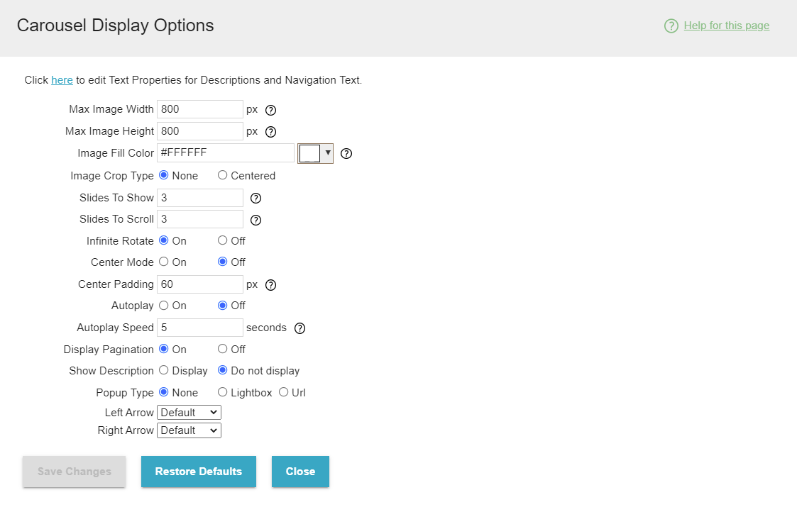
You can edit some appearance settings for the photo gallery by editing the widget and clicking the Display Options tab. Some options will only display for certain types of gallery.

- Max Image Width - Determines the maximum width of the image thumbnails.
- Max Image Height - Determines the maximum height of the image thumbnails.
- Image Crop Type - Crops the image thumbnails to fit smoothly in the Max Image Height / Max Image Width.
- Slides to Show - Determines how many images are shown at once.
- Slides to Scroll - Determines how many images are show when an arrow is clicked to scroll
- Infinite Rotate - Determines whether or not the gallery will start from the beginning if scrolled to the wind, and vise versa.
- Autoplay - Determines whether the slideshow automatically starts when the page loads.
- Autoplay Speed - Determines how long before the gallery scrolls again while autoplay is on.
- Display Pagination
- Show Description
- Popup Type - Determines whether clicking the image thumbnails opens the larger image in a Lightbox or links to a URL.
- Left Arrow - Lets you choose a new image to be the left scroll arrow.
- Right Arrow - Lets you choose a new image to be the right scroll arrow.
